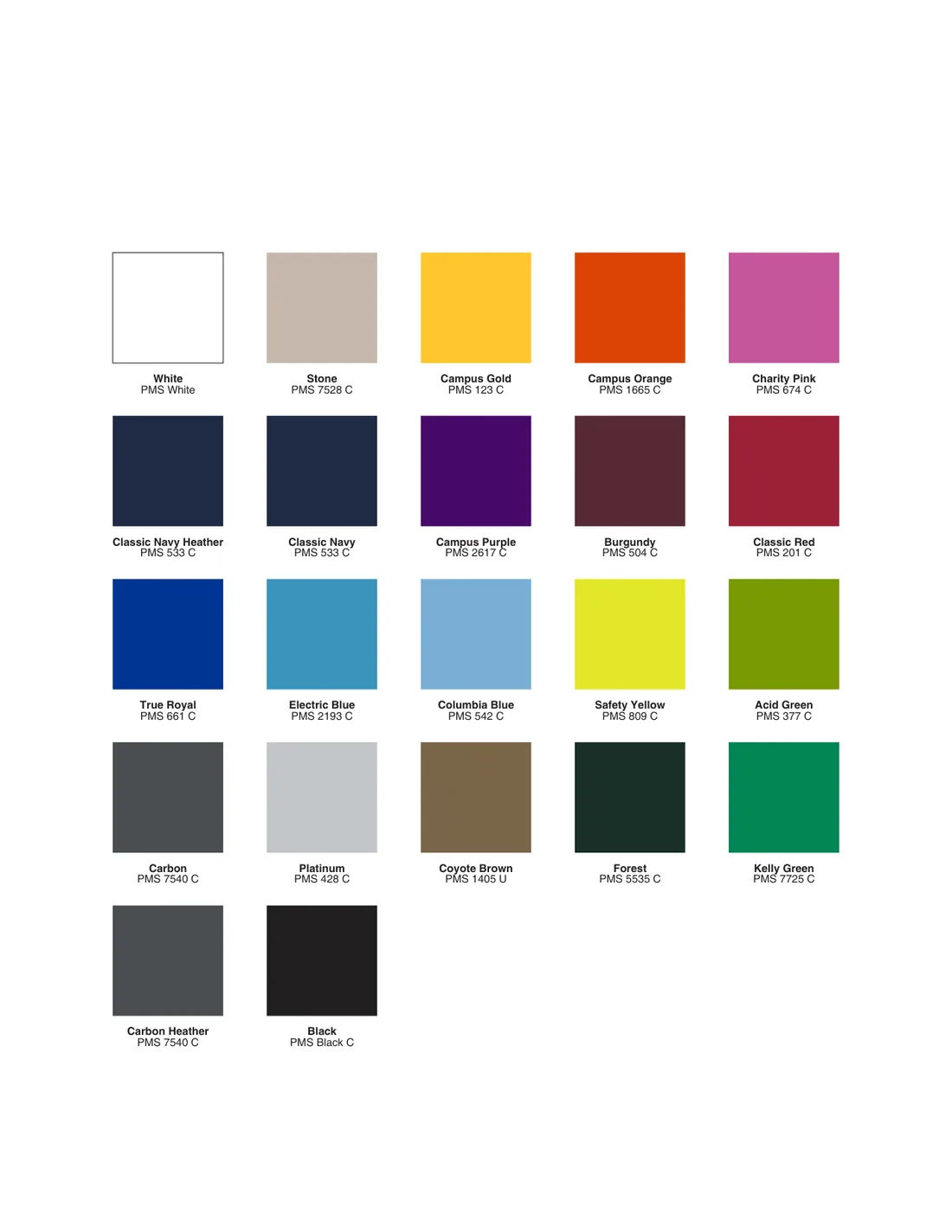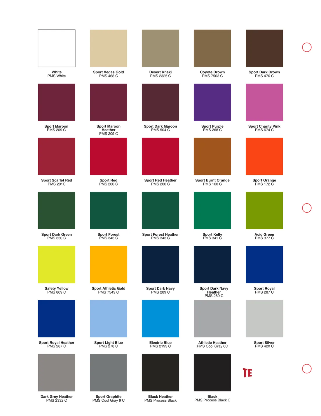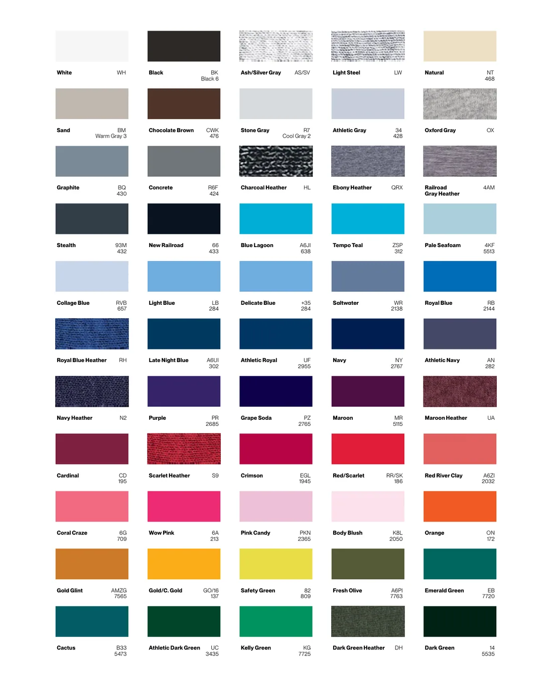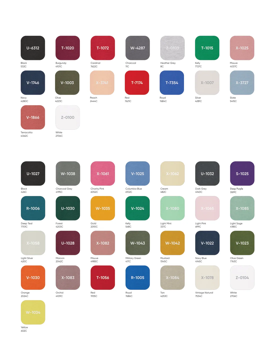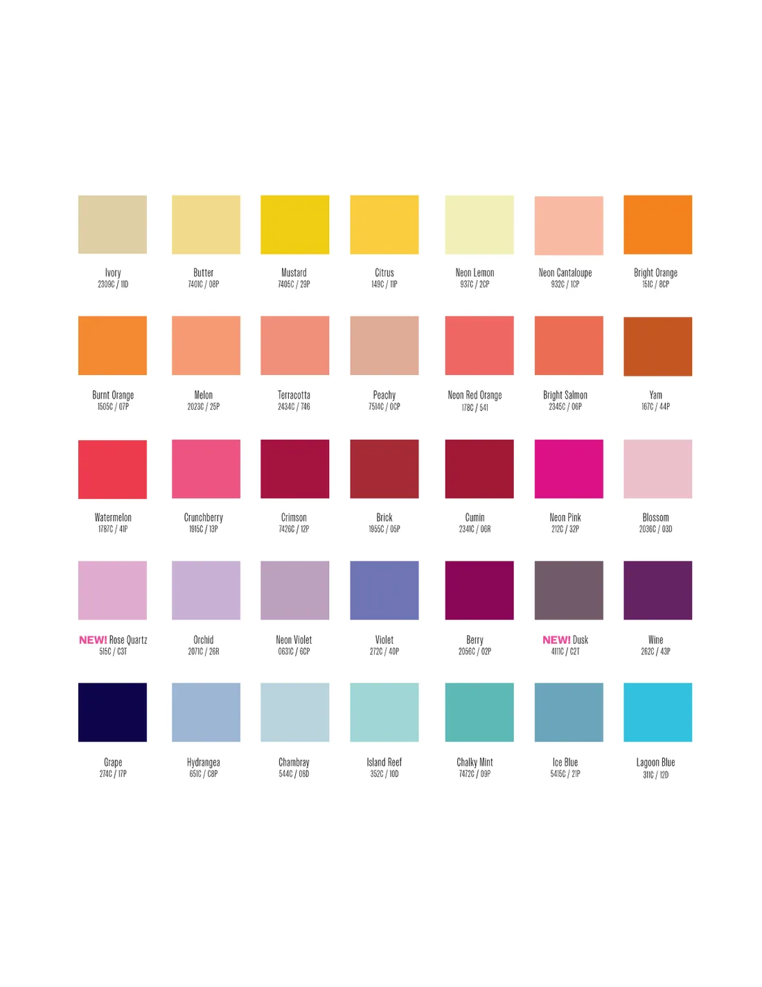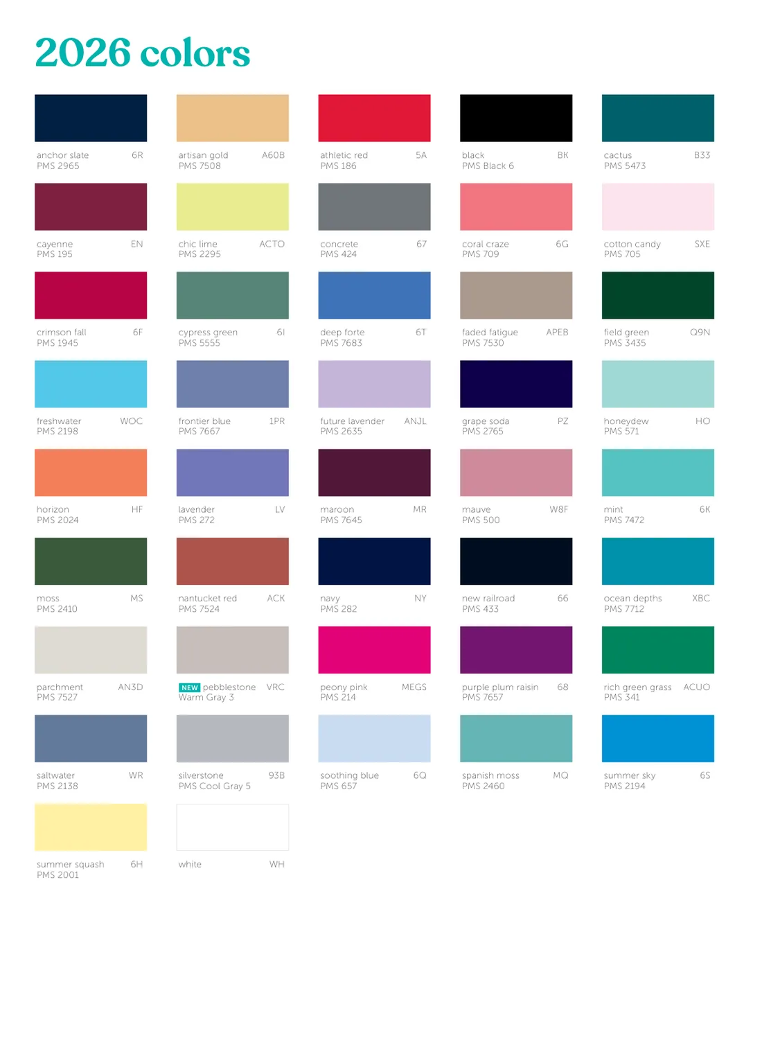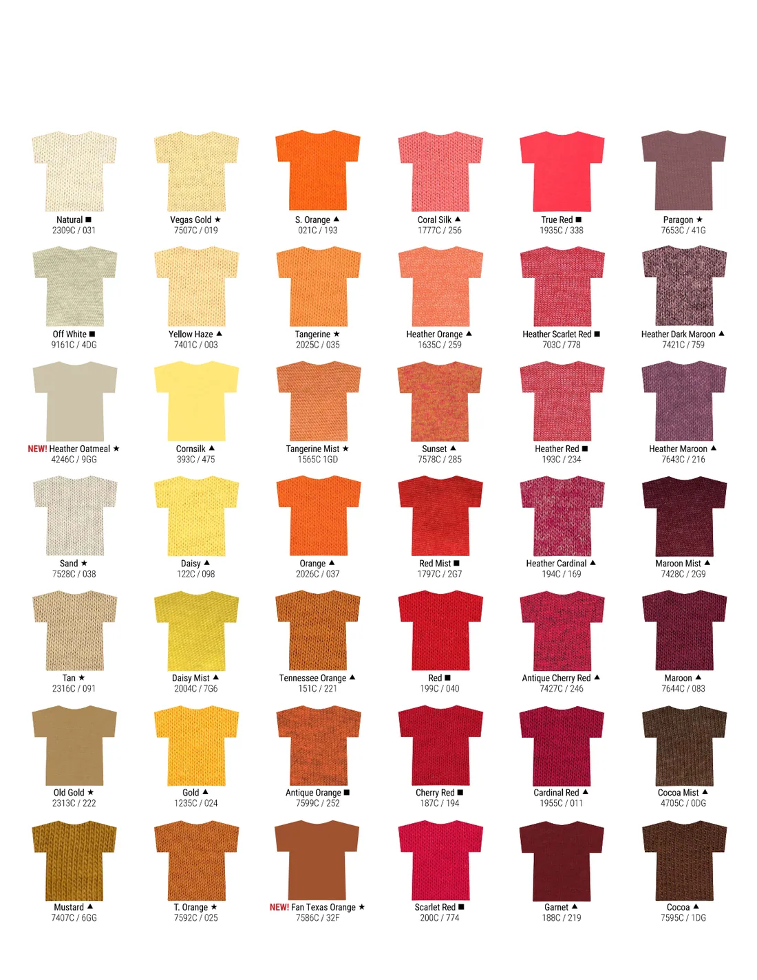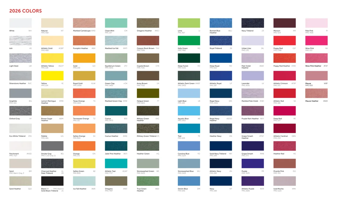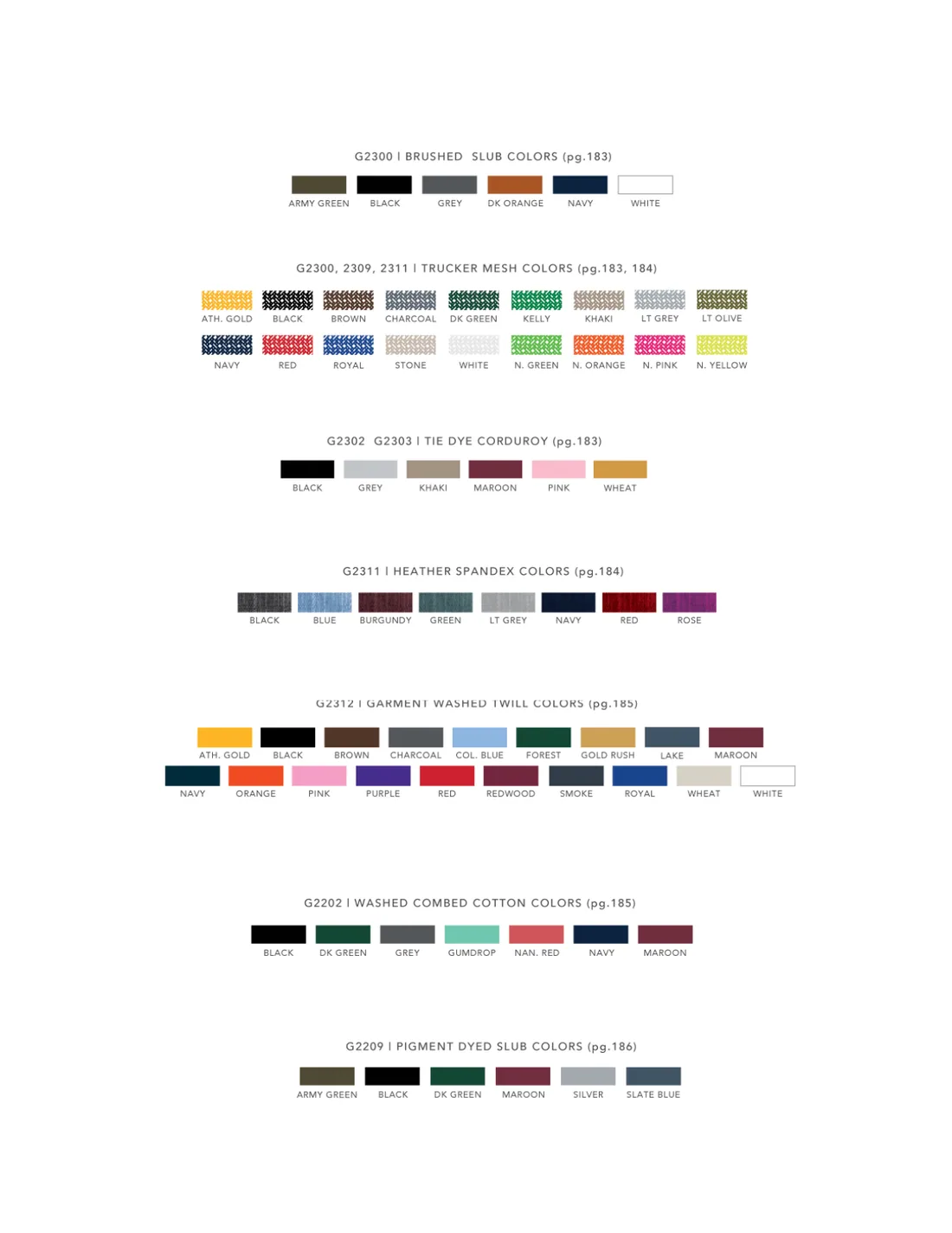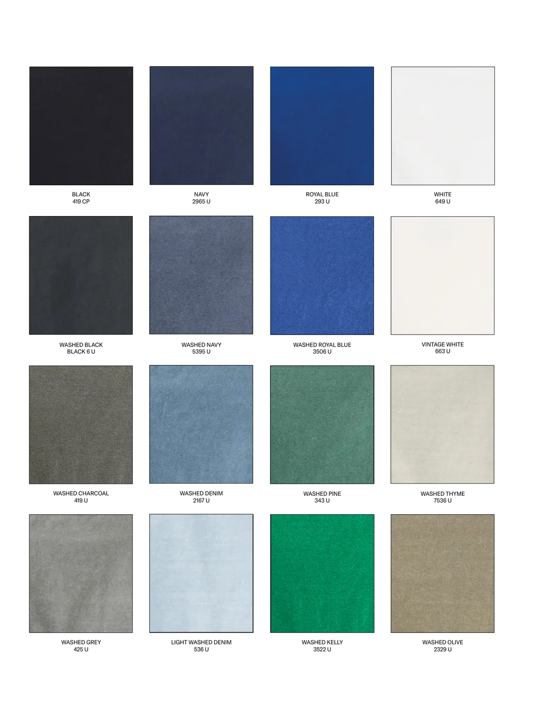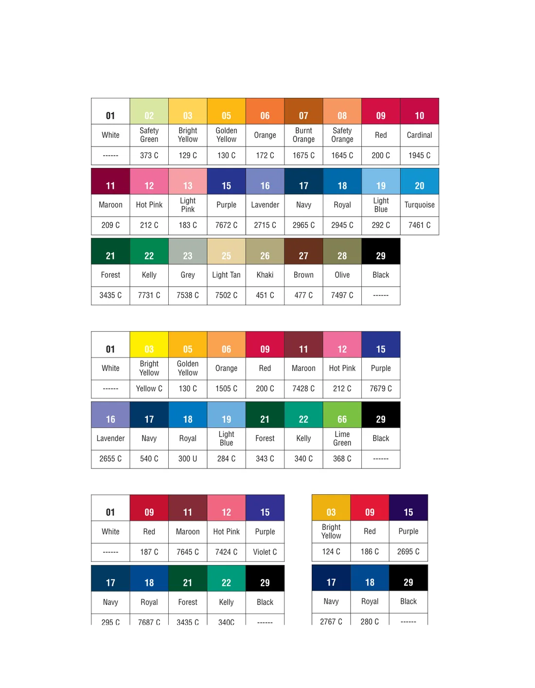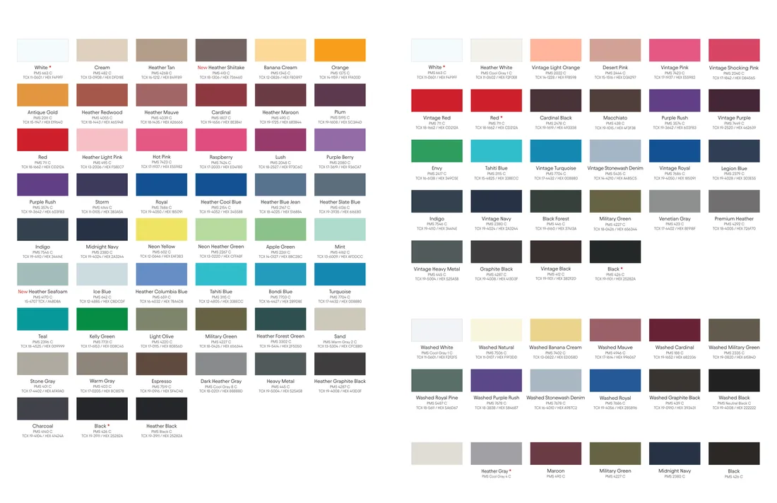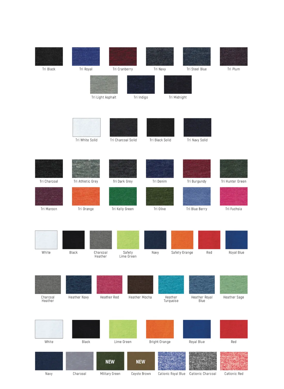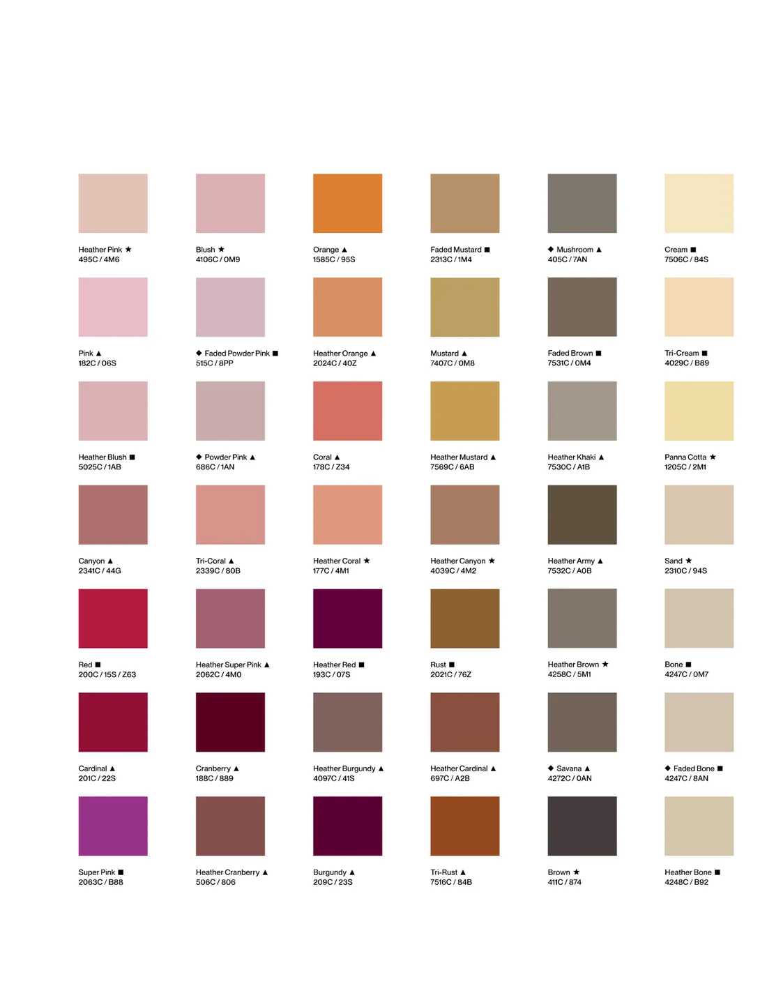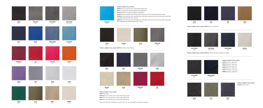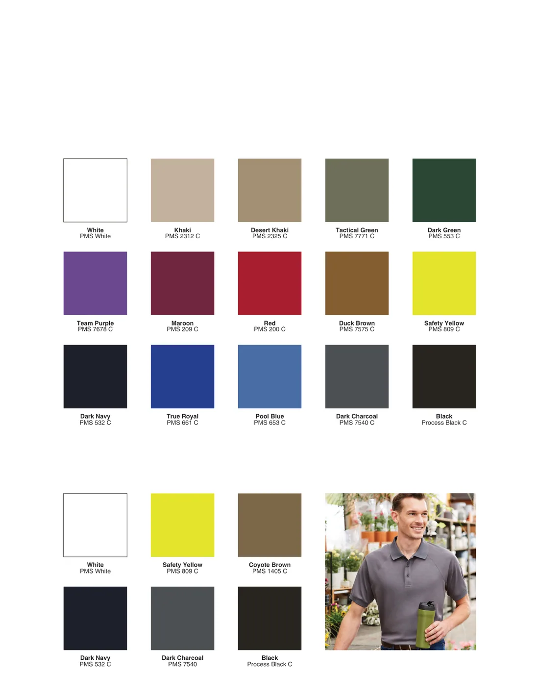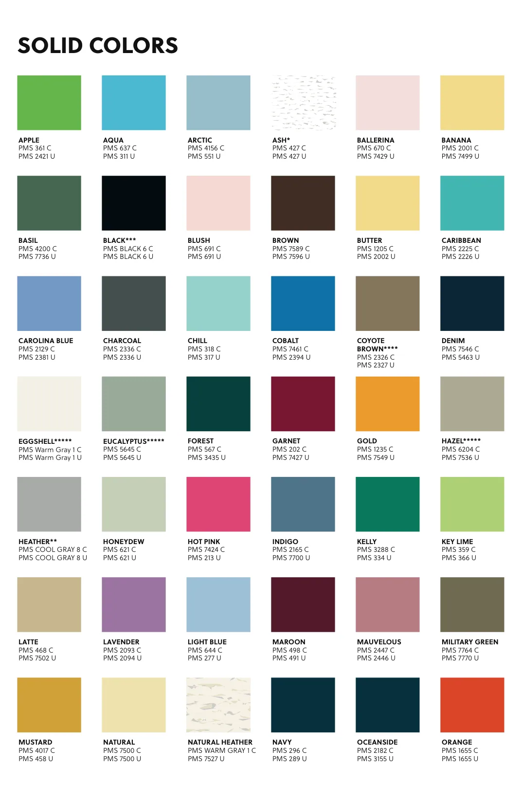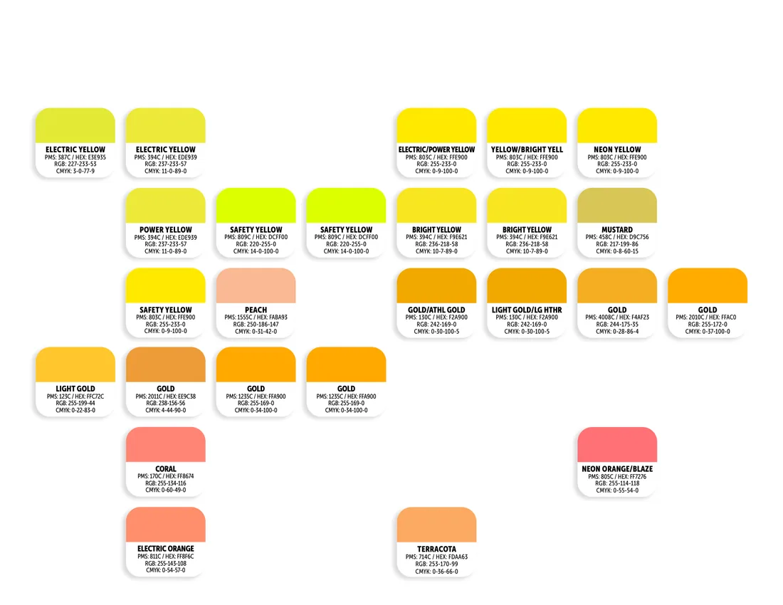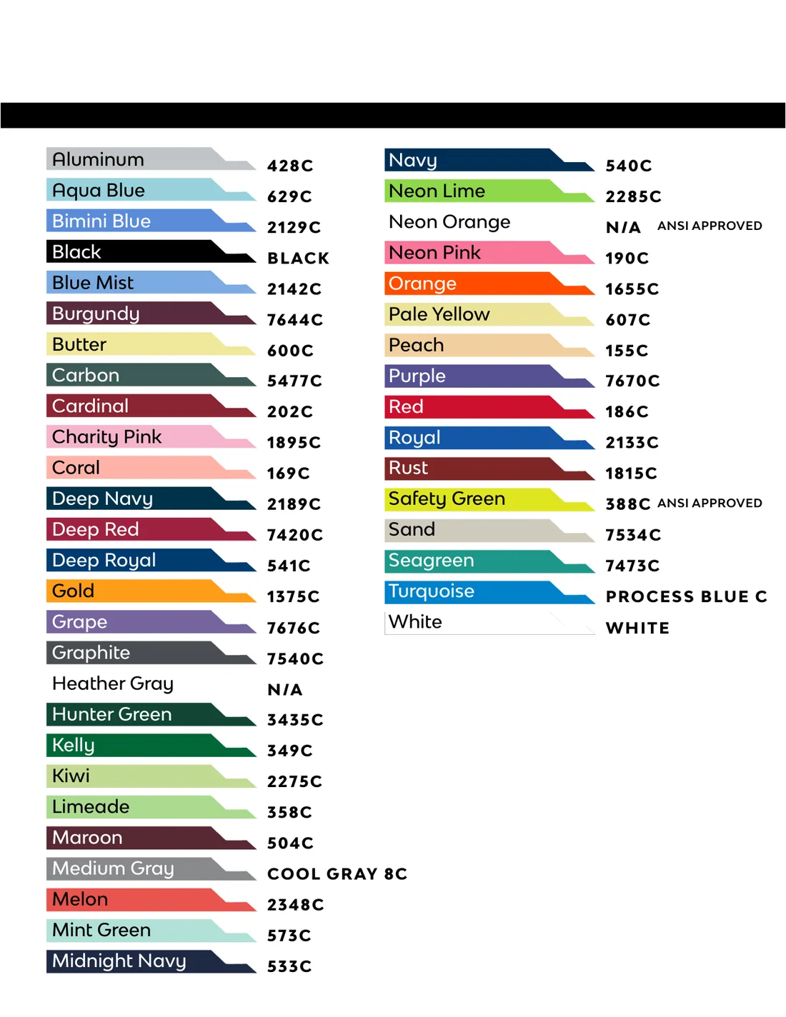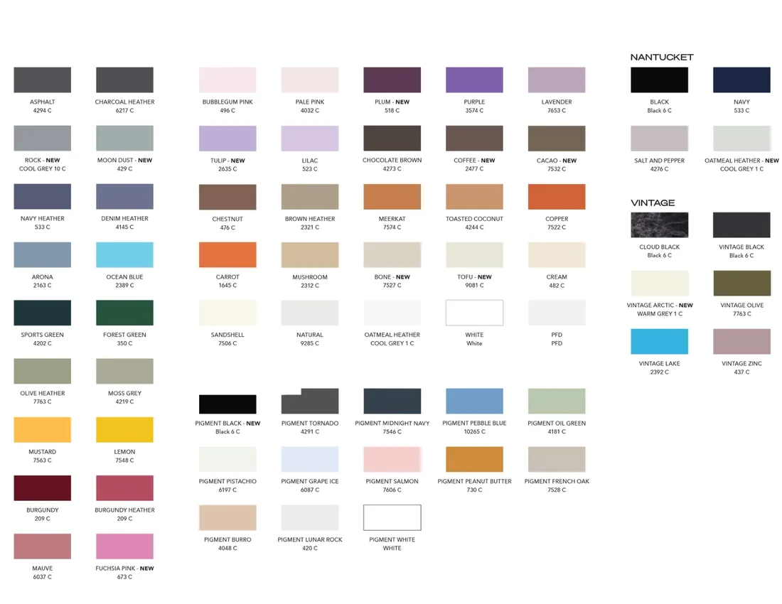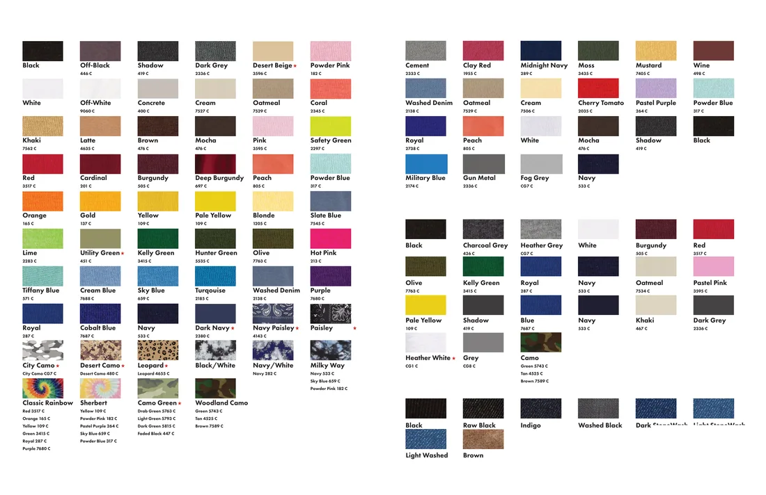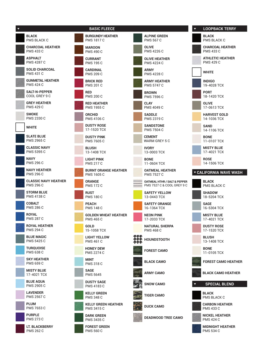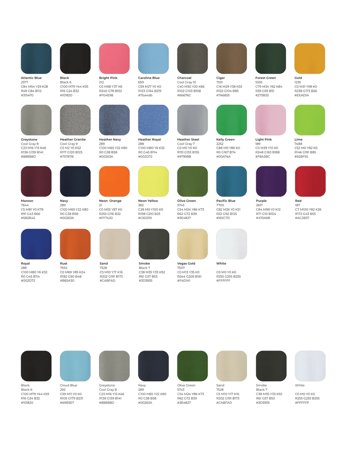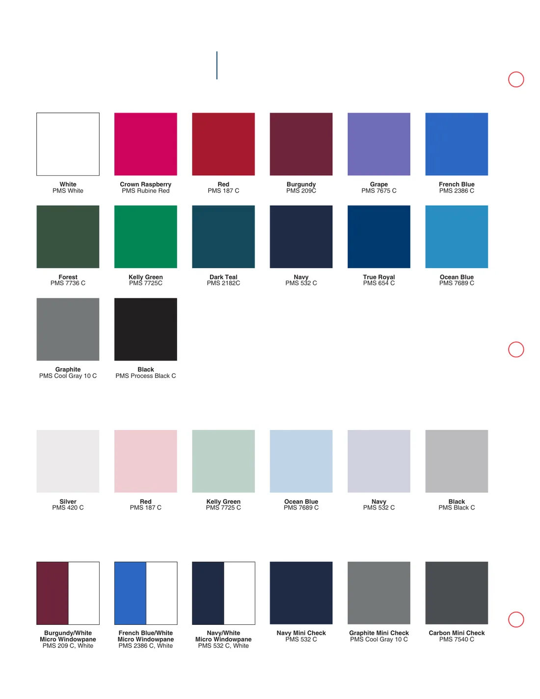
Colour cards

Colour cards by brand route

Choosing a blank colour is not a taste question — it is a positioning question. A club kit, a streetwear drop and a hotel uniform can all be "navy" and none of them should be the same navy. These 27 cards are palettes we have already matched to the route a buyer is building, so you start from a workable range instead of a colour wheel.

27 cards · 124 pages · Pantone references as printed on the mill card. View on screen, download the card, then approve from a physical swatch.

1Find the route that describes your customer
2Open the card and pick two or three colours, not twelve
3Ask for a physical swatch before the order is placed
Organic and sustainability-led brand colour card

Organic and sustainability-led brand

Buyers who lead with fibre story and certifications-free claims: organic cotton, natural dyes, low-impact washes.

4 pages
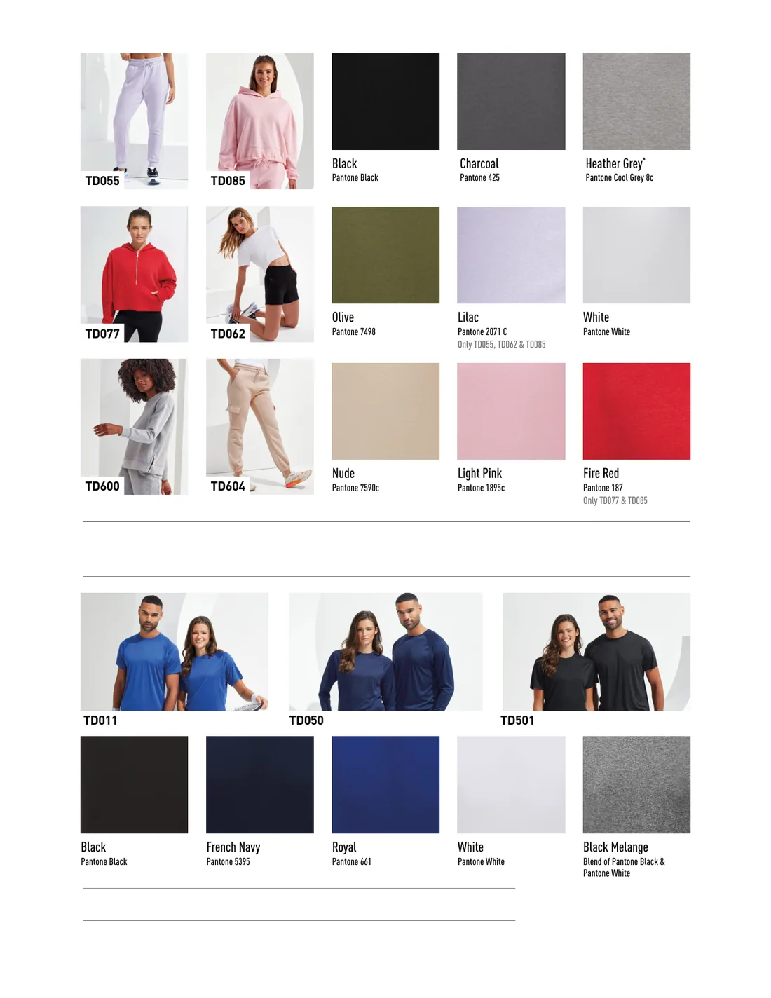
Fitness, training and athleisure — European market colour card

Fitness, training and athleisure — European market

Gym, studio and training brands selling into the EU, where lighter weights and tighter fits dominate.

1 page
Functional outerwear and outdoor colour card

Functional outerwear and outdoor

Outdoor and technical apparel: layered systems, muted palettes, performance trims.

1 page
Team apparel colour card

Team apparel

Club and team uniform programmes where colour has to match an existing kit.

1 page
School sport, team sport and gym programmes colour card

School sport, team sport and gym programmes

Institutional buyers: schools, colleges and gyms running annual kit orders.

2 pages
Core basics colour card

Core basics

The straight retail basics range — the palette a general-purpose blank programme starts from.

5 pages
Vintage wash, print-led streetwear colour card

Vintage wash, print-led streetwear

Faded, garment-dyed looks where a slightly uneven tone is the product, not a defect.

3 pages
Americana and heritage lifestyle colour card

Americana and heritage lifestyle

Heritage look: warm neutrals, deep indigo, oxblood — the palette behind most "made in USA" style branding.

1 page
High-volume basics and promotional colour card

High-volume basics and promotional

Price-led programmes where the shirt is a carrier for a logo and the colour range has to be shallow.

4 pages
Volume basics, promotional and everyday wear colour card

Volume basics, promotional and everyday wear

Bulk buyers mixing promotional runs with everyday retail stock.

1 page
Everyday basics colour card

Everyday basics

The smallest, safest palette — what sells all year without a season.

2 pages
Fashion print and brand merch, hand-feel led colour card

Fashion print and brand merch, hand-feel led

Music, creator and brand merch where the print is the product and the blank has to disappear under it.

10 pages
Fashion accessories colour card

Fashion accessories

Accessory-adjacent apparel: small ranges, strong colours, low minimums.

1 page
Print-result and hand-feel driven colour card

Print-result and hand-feel driven

Buyers who choose the blank by how it prints: discharge-friendly darks, smooth faces, soft hand.

3 pages
Sustainability and consistency colour card

Sustainability and consistency

Programmes where the second order has to match the first — dye-lot discipline over novelty.

3 pages
Fit and fabric quality — retail-grade basics colour card

Fit and fabric quality — retail-grade basics

Premium basics sold on drape and hand: heavier jerseys, boxy fits, restrained colour.

3 pages
Streetwear brand — palette A colour card

Streetwear brand — palette A

High-contrast streetwear: black-led, one accent, oversized bodies.

1 page
Streetwear brand — palette B colour card

Streetwear brand — palette B

Streetwear with a washed, mid-tone base: sage, clay, off-black.

2 pages
Streetwear brand — palette C colour card

Streetwear brand — palette C

The widest streetwear range: garment-dyed darks plus seasonal accents.

5 pages
Club and team sports colour card

Club and team sports

Football, rugby and club kit: strong primaries, matching trims, repeatable by team.

31 pages
Multi-category apparel brand colour card

Multi-category apparel brand

A brand spanning basics, active and lifestyle in one catalogue.

1 page
Streetwear and creator brands — premium custom colour card

Streetwear and creator brands — premium custom

Creator-led drops where the blank is part of the perceived value.

1 page
Streetwear heavyweight — West Coast colour card

Streetwear heavyweight — West Coast

280gsm-plus bodies, boxy cuts, sun-faded palette.

2 pages
Streetwear — premium custom colour card

Streetwear — premium custom

Small-run premium streetwear with a tight, deliberate palette.

2 pages
Value performance — workwear, school and hospitality uniforms colour card

Value performance — workwear, school and hospitality uniforms

Uniform programmes: navy, grey, black, plus the hi-vis adjacent tones procurement asks for.

2 pages
Performance sport and team spirit colour card

Performance sport and team spirit

Technical team kit and fan merchandise from the same palette.

31 pagessame palette as another route
Premium classic, detail-led colour card

Premium classic, detail-led

Heritage detail: small palette, exact repeats, nothing trend-led.

1 page

Screen colour is not garment colour

Every monitor renders the same hex value differently, and a mill dye bath renders differently again. A colour approved on screen and then dyed will not match, and that is not a defect — it is physics. Treat the card as a shortlist and the physical swatch as the decision. That is also why we do not quote an exact Pantone match from a photograph.

Why the palettes are short

A twelve-colour first range strands eight of them. The cards here are deliberately two to six colours deep per route, because a first order should test a look rather than fill a catalogue. If the route works, the range expands on the second order with stock colours that are still available — which is the other half of the argument for keeping the first palette shallow.

How to read a mill card

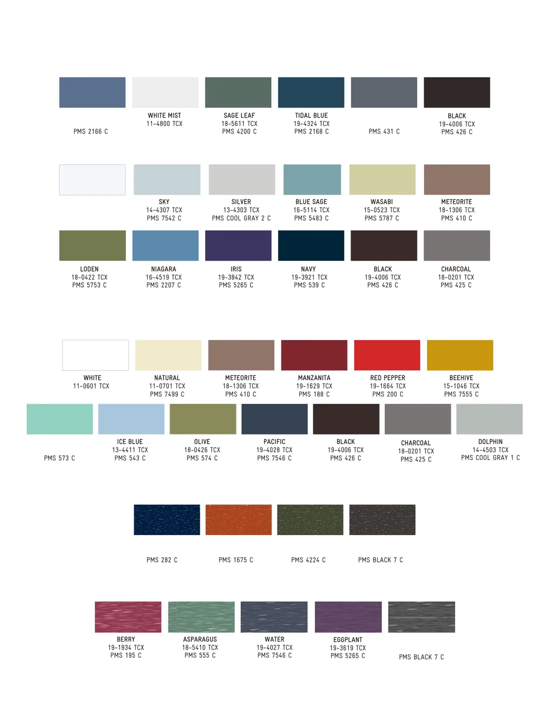
  • TCX is the Pantone fashion, home and interiors cotton reference — a two-part code such as 19-4006. It is the closest thing to a shared language between a buyer, a mill and a dyer.
  • PMS is the Pantone Matching System used for print ink. A PMS number on a garment card is usually the nearest print match, not a dye recipe.
  • Two-letter or numeric codes (the kind you will see on some cards) are the mill's own stock references. They only mean something with that mill, so they are for reordering the same garment, not for matching a different one.

Need a swatch, or a colour we have not listed?

Tell us the route and the colours you are considering. We send physical swatches, and where a colour is not in stock we tell you the dye-bath minimum rather than pretending it is available.